The layout of the pages in VIDA is roughly divided into three main types. See the sections below for a description.
Home tab pages layout
-
Upper main menu
-
-
-
-
-
-
-
Main content panel
-
Right-hand panel
-
Footer
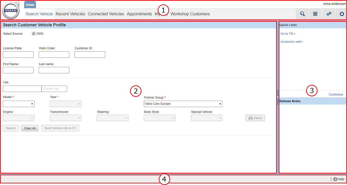
This is the main navigation menu for the tab which is mainly involved when selecting a vehicle to specify a vehicle profile. Under the tab, the upper main menu consists of the following main tabs:
This is the primary workspace for the tab. The content of this panel changes in accordance to what is selected in the upper main menu (1). The width of the content area is customized by dragging the splitter between the two panels (2 and 3) or by clicking the arrow on the splitter.
This panel contains quick links as well as news and updates. The content of this panel is fixed and not affected by any tasks performed under the tab. The quick links are customizable. For further information, see the article Customizing quick links.
The footer is always available and contains a link to the help file.
Vehicle tab pages layout
-
Upper main menu
-
-
-
-
-
Vehicle information bar
-
Left-hand menu panel
-
Main content panel
-
Footer
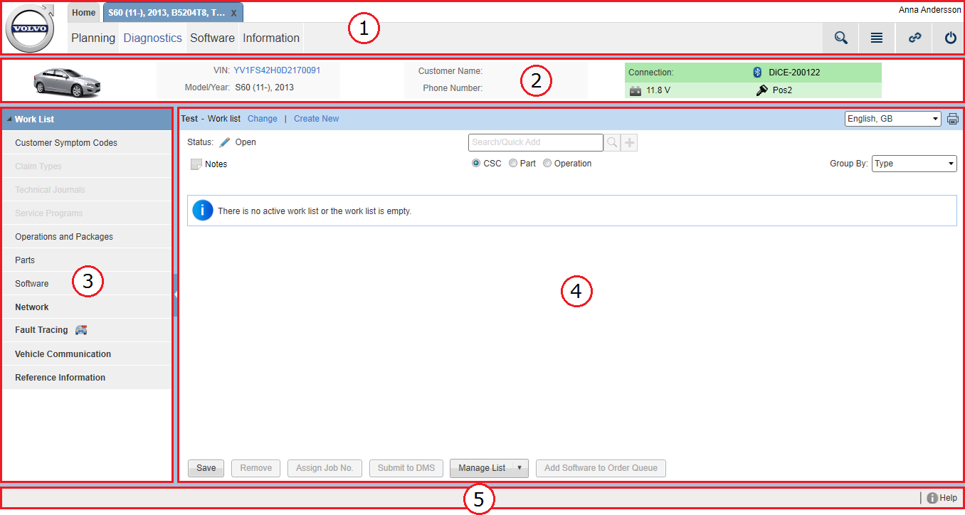
This menu is displayed when a vehicle is selected. A selected vehicle is always opened in its own new tab. Under the vehicle tabs, the upper main menu consists of the following main tabs:
The vehicle information bar is always available under the vehicle tabs. It displays basic information about the selected vehicle.
This menu holds secondary and subsequent menus. The menu listed in this panel changes in accordance to what is selected in the upper main menu (1). The menu items are expandable and only one menu item at a time can be selected.
This is the primary workspace for the vehicle tabs. The content of this panel changes in accordance with what is selected
in the upper main menu (1) and in the left-hand menu panel (2). The width of the content area is customized by dragging the
splitter between the two panels (3 and 4), by clicking the arrows on the splitter or by clicking the  and
and  icons in the upper-right corner of the page.
The footer is always available and contains a link to the help file.
Vehicle tab pages layout, diagnostic pages
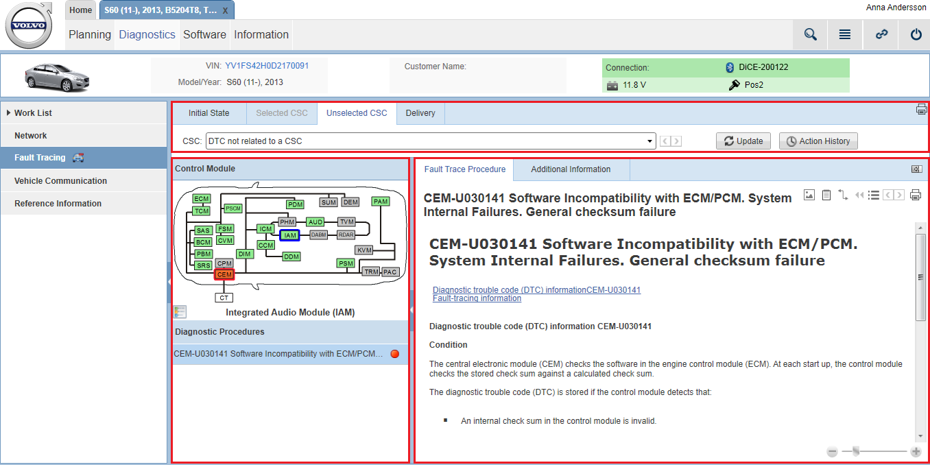
On pages that handle diagnostic functionalities, the navigation differs compared to other pages under the vehicle tabs. The upper main menu, the vehicle information bar and the left-hand menu panel are the same but the main content panel differs and is divided into two or three areas. The content of these areas differs depending on what menu item you have selected in the left-hand menu panel.


